- Click on the Analytics tab present at the center of the footer of your Mobile App, this will take you to the summary section of the Analytics page.
Summary:
A dashboard of yours, viewing participation metrics, performance metrics, Strengths, and weaknesses.
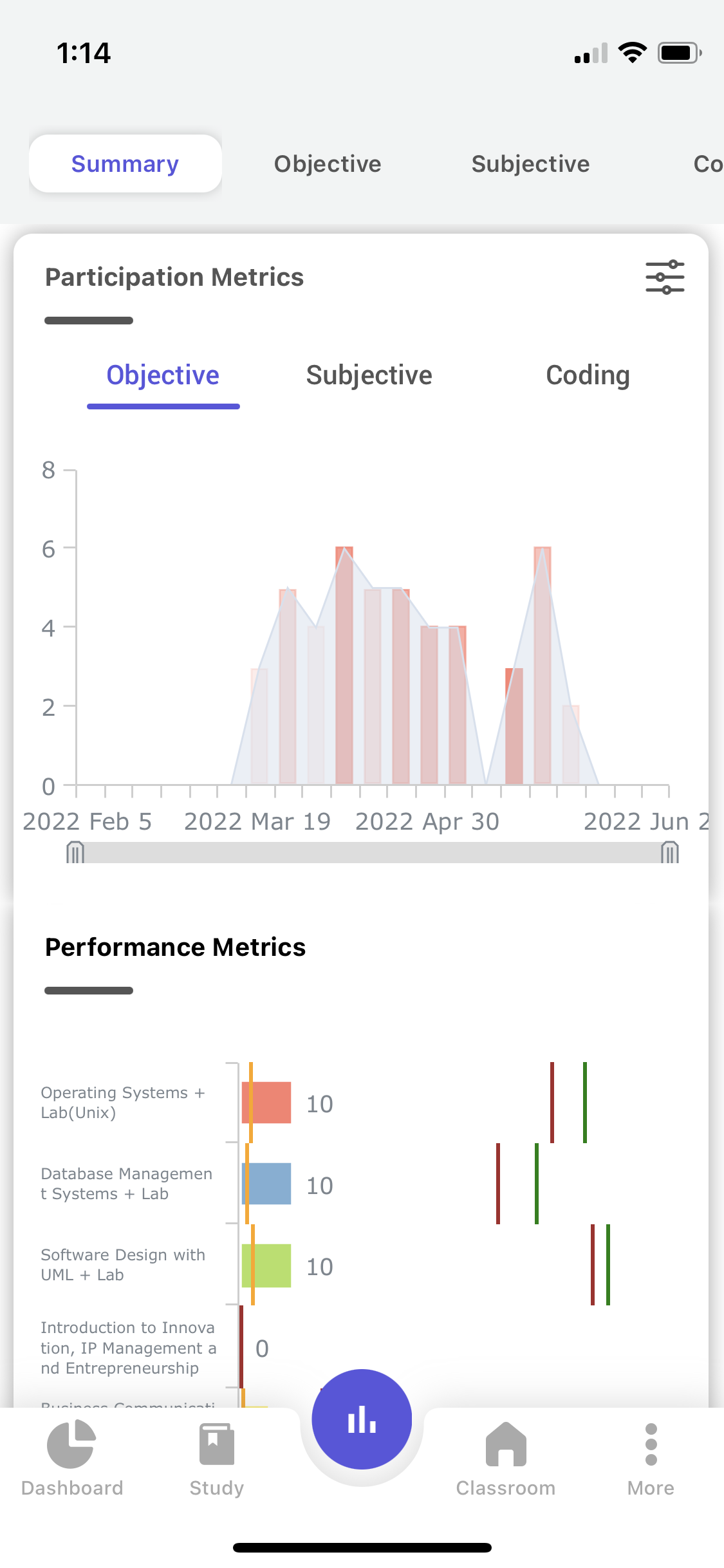
a. Participation Metrics:-
It gives an overview of all the Assessments (Objective, Subjective, and Coding) that you have attempted.
2. Select either objective or subjective or coding. (The default selection is objective).
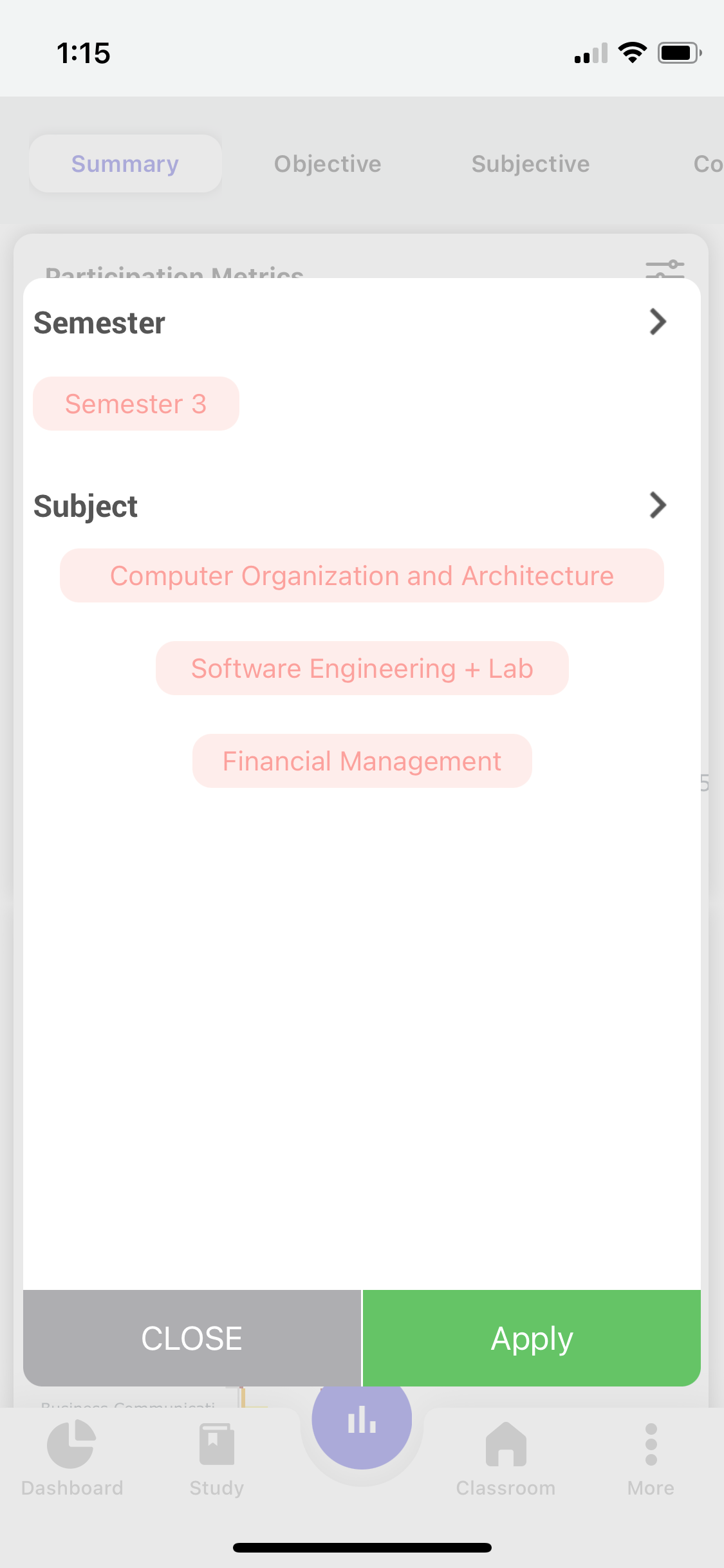
3. The participation metrics are shown for all the subjects in the current academic semester.
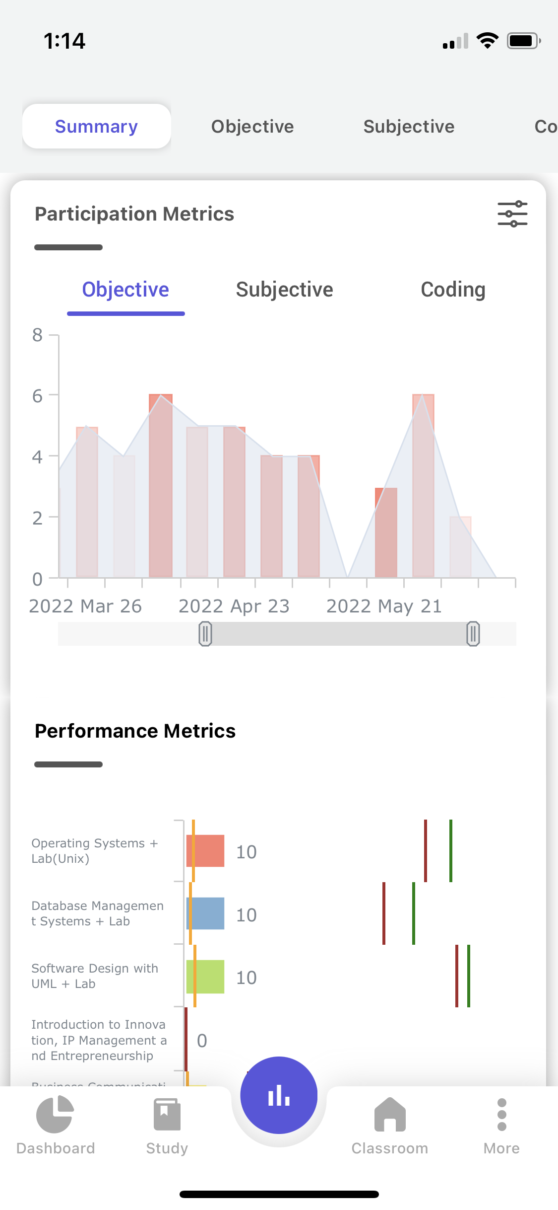
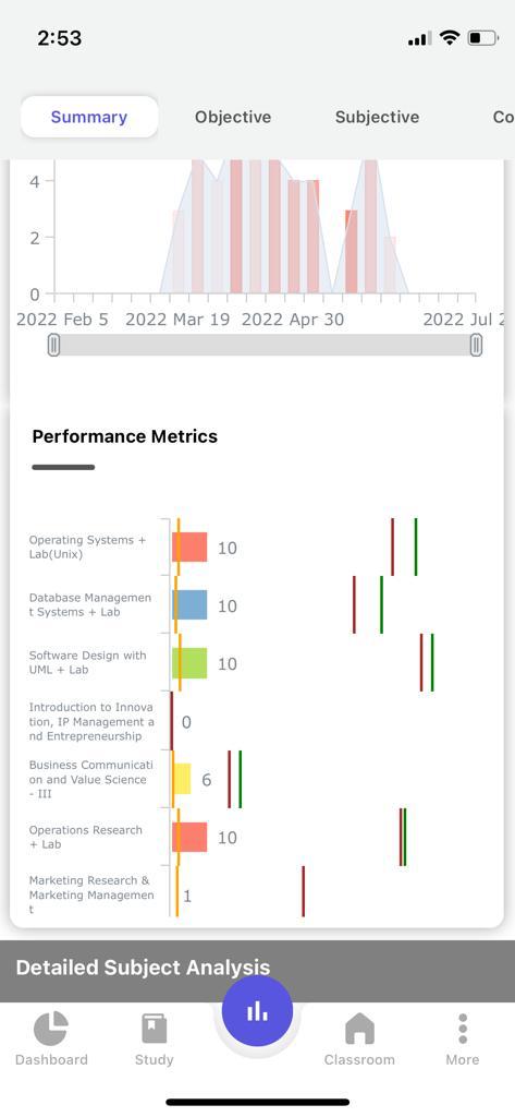
4. The area plot in the graph depicts the Total Number of tests you are assigned by the faculty in a particular week and the bar indicates the total number of tests that you have attempted in that week.
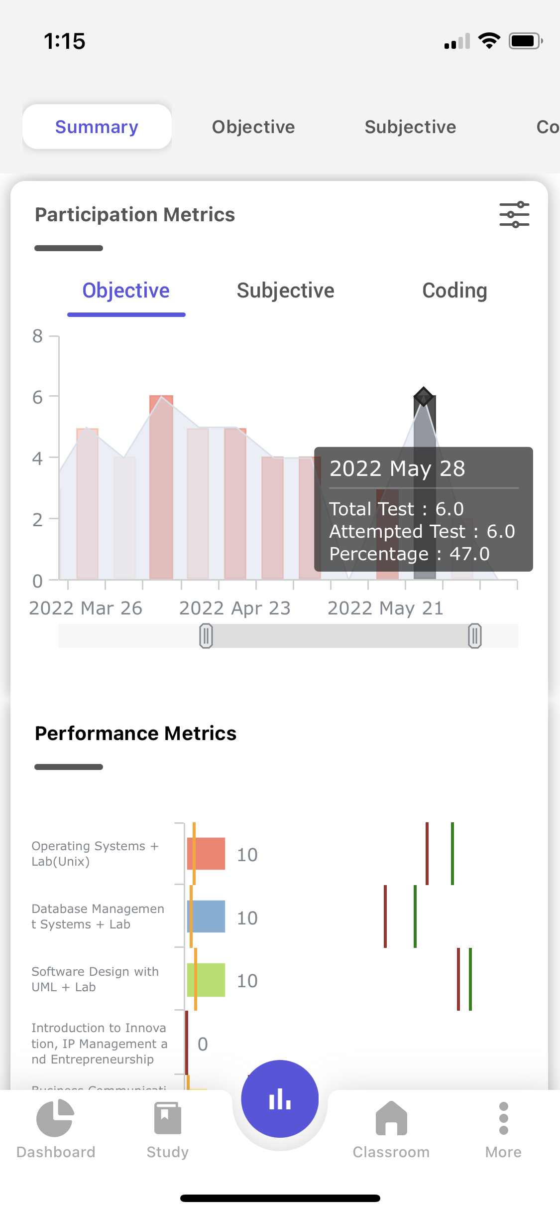
5. The density of color on the bar depicts the performance in the week, for example:- the more the intensity of the Red color more the performance.
6. In order to view the graph more closely, you can pinch-zoom the graph or compress and expand the scale present below the graph.
7. In order to get the subjective and coding analytics, select the subjective and coding filter options presented above the graph.
8. To use the custom filter select the custom filter option, where a pop-up page appears with semester and subjects, Select the required semester and subjects and click apply.
9. When tapping on the graph, you will be able to view the total tests that took place, attempted tests, and percentage obtained for that particular week.
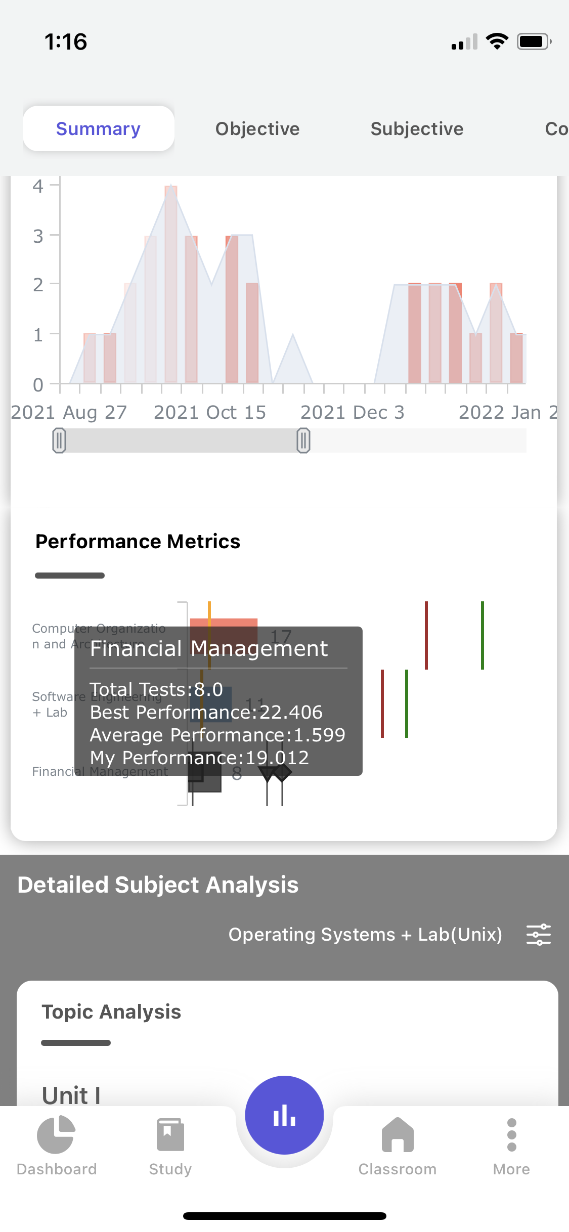
b . Performance Metrics :
For all the Assessments you have participated in, here you can see your Performance compared with the Average class performance and Top Performer, in each of the subjects across all semesters.
10. Each subject is depicted with a colored bar. On tapping the graph it shows:
- Average Class performance(Percentage) for all the Assessments in that subject.
- Top Performer, Average performance of all the assessments combined.
- Your Average Performance(Percentage) in all the Assessments combined.
Tap on the fences or bar to get information in detail.
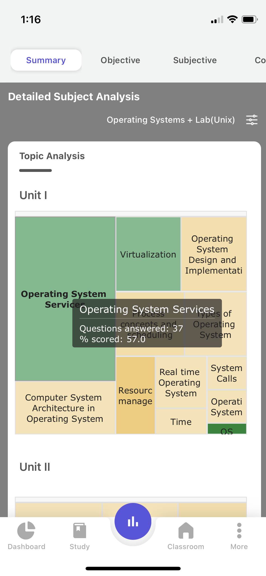
c. Detailed subject analysis :
This gives you insights into the Number of Right answers (Color) given you and the Total Number of Questions (Size of Topic) attempted in all the Assessments that you have participated in.
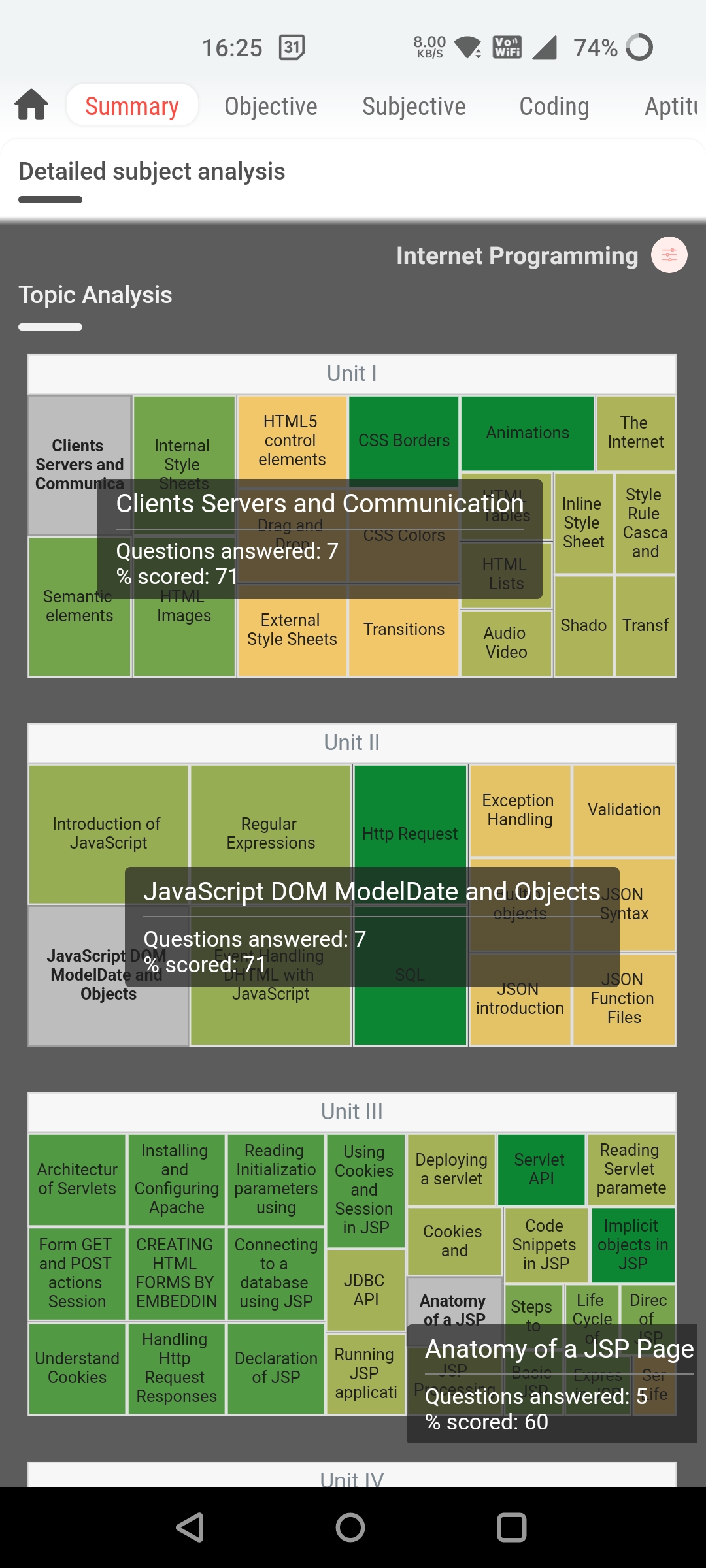
11. The Name of the Subject is given at the top of the Chart.
12. The tree map depicts your Strength and Weakness Analysis of all the Topics in a Unit of that particular subject.
13. The size of the Topic(in a given Subject) indicates the Total Number of Questions attempted by you for that Topic in all the Assessments.
14. The Color of the Topic indicates the right answers given by you on that topic, here Red color explains that this Topic is your weakness, and the Green color explains that this Topic is your Strength.
15. Tap on the Topic to get information in detail.
16. Select the custom filter option, select the required semester and subjects and click on apply.
17. On applying the filter a tree map chart appears with the selected subject on the top and unit-wise pic charts for that respective subject.
18. Choose Semester, Subject, and apply the filter to fetch the analysis for the selected subject.
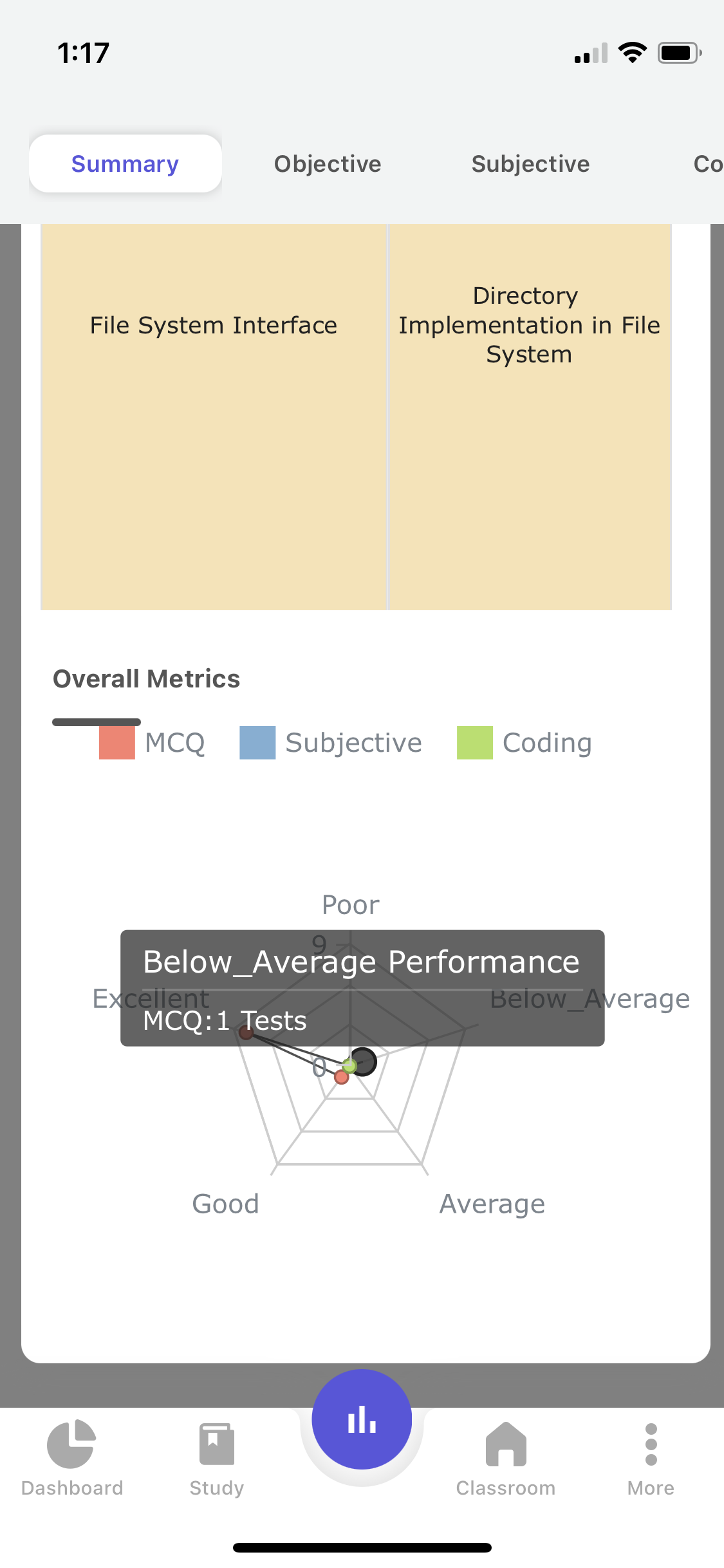
e. The overall metrics :
A Radar Plot showing your standing in the participated assessments (Objective, Subjective, Coding).
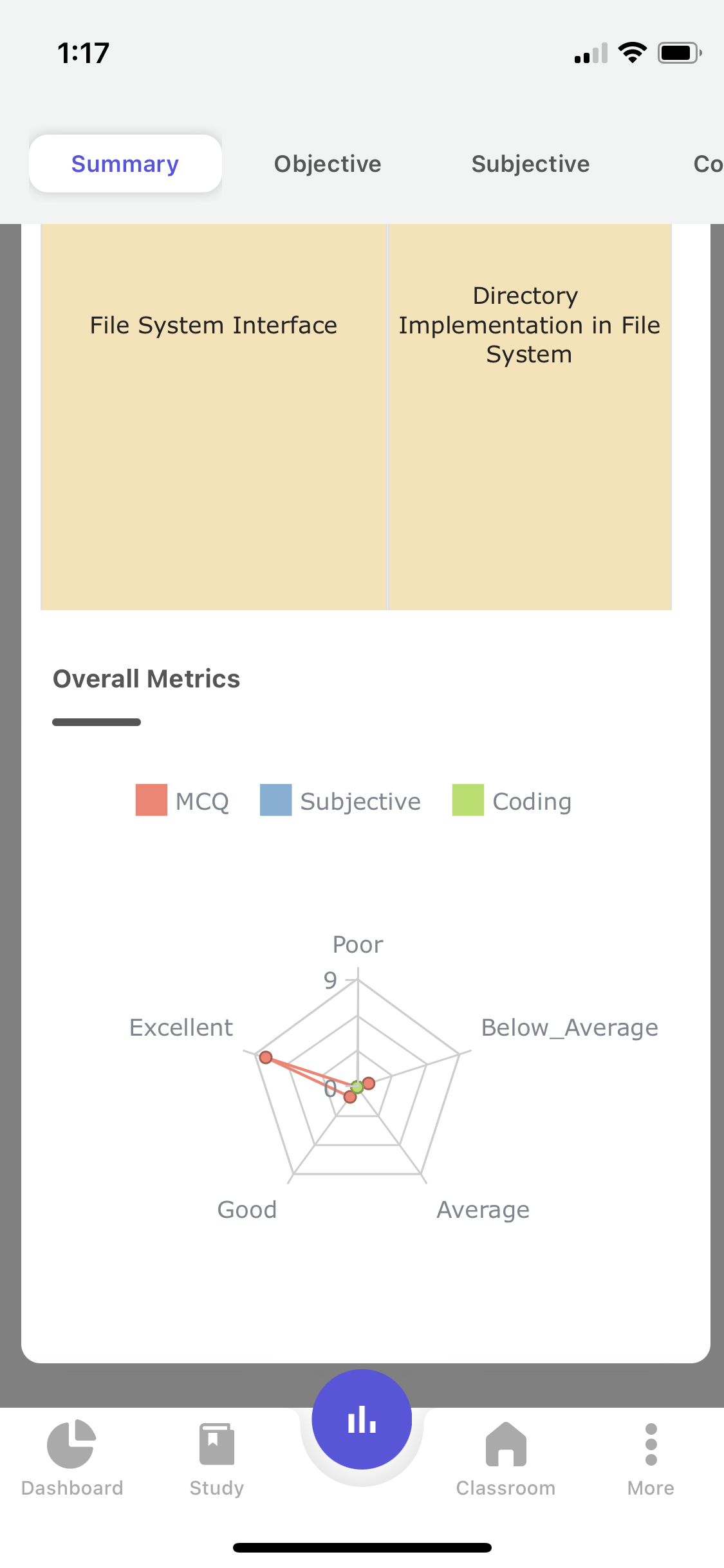
19. The edges or vertices of the Radar Plot show you the Number of Assessments attempted falling under the Excellent, Below average, Good, Average, and poor performance categories.
20. Objective, Subjective, and Coding Assessments are given in different colors.
21. Tap on the Graph to get more information.
22. Pinch Zoom on the graph for a detailed view of the plot.
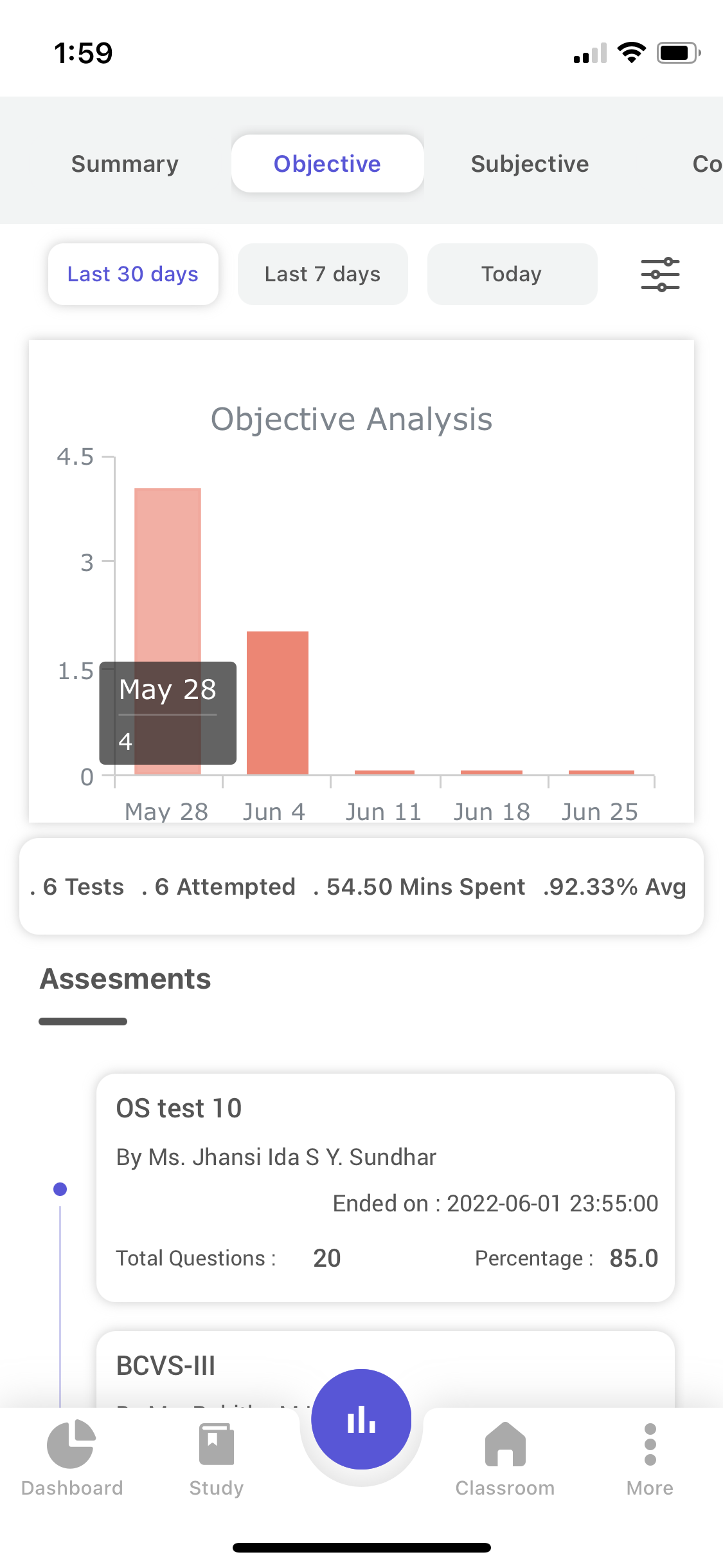
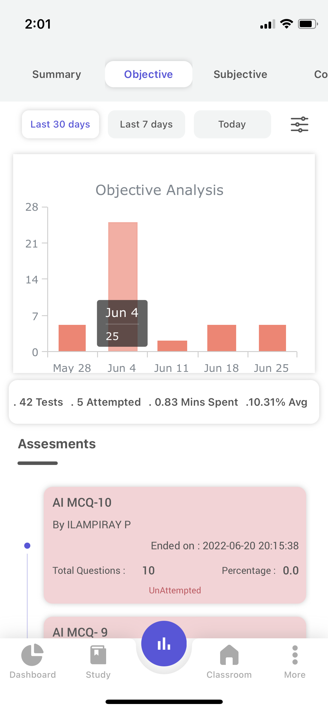
Objective Analysis:-
This section will present all the Assessments with details. In a later update, you will be able to get the Detailed Analytics report related to the assessment with a click on it.
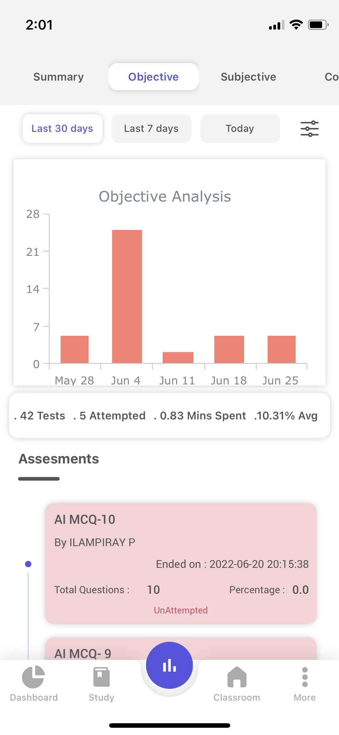
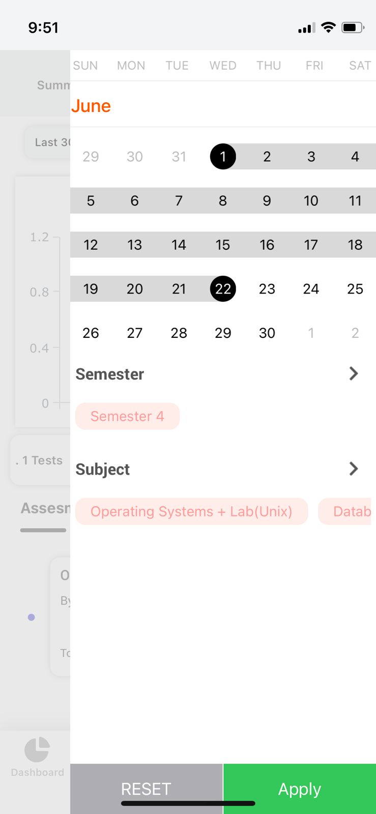
23. The bar graph shows the number of tests attempted by you in the last 30 days or last 7 days or Today, you can as well choose a particular time period and/or subject by clicking on the custom filter.
- Once you click on the Custom filter button the filter card appears with the calendar, semester, and subject options.
- Select the desired date, semester, and subjects and click on apply. The filter will be used for all the analyses.
- To revert the custom filter click on the Reset option.
24. The following details are given in for all the Assessments(Objective) in the specific time period,
- The Total Number of Assessments(Objective) assigned by your faculty
- Total Number of Assessments(Objective) Attempted by you.
- The Total Time Spent(in Minutes) by you in all the Attempted Assessments(Objective).
- Average Percentage scored by you in all the Assessments(Objective).
25. In a later update, you will be able to get the Detailed Analytics report related to the assessment with a click on it.
26. The Assessments(Objective) which are not attempted by you will be given in Red color.
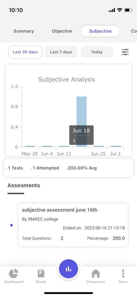
Subjective Analysis :
This section will present all the Assessments with details. In a later update, you will be able to get the Detailed Analytics report related to the assessment with a click on it.
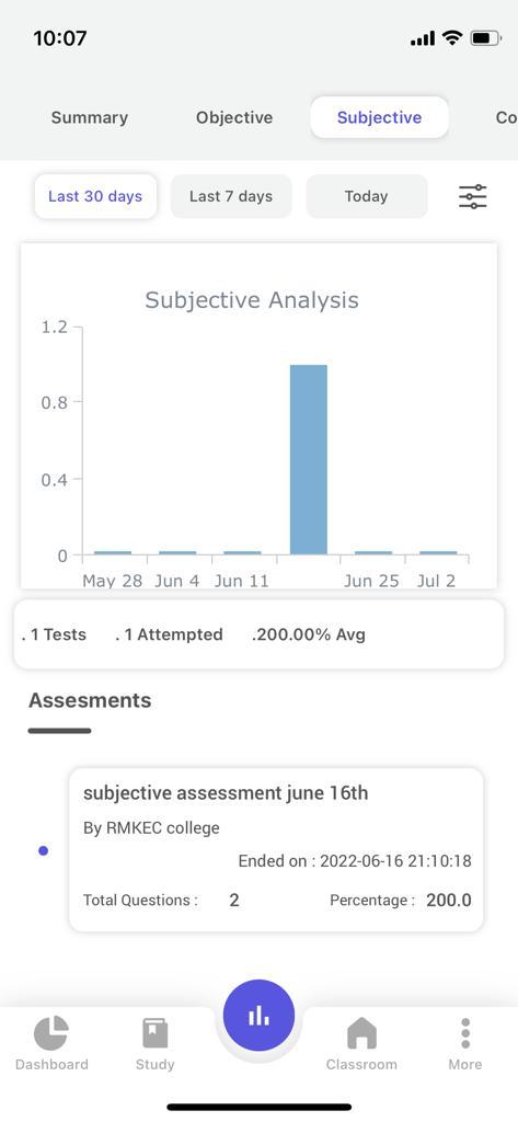 27. The bar graph shows the number of tests attempted by you in the last 30 days or last 7 days or Today, you can as well choose a particular time period and/or subject by clicking on the custom filter.
- Once you click on the Custom filter button the filter card appears with the calendar, semester and subject options.
- Select the desired date, semester and subjects and click on apply. The filter will be used for all the analyses.
- To revert the custom filter click on the Reset option.
28. The following details are given in for all the Assessments(Subjective) in the specific time period,
- The Total Number of Assessments(Subjective) assigned by your faculty
- Total Number of Assessments(Subjective) Attempted by you.
- The Total Time Spent(in Minutes) by you in all the Attempted Assessments(Subjective).
- Average Percentage scored by you in all the Assessments(Subjective).
29. In a later update, you will be able to get the Detailed Analytics report related to the assessment with a click on it.
30. The Assessments(Subjective) which are not attempted by you will be given in Red color.
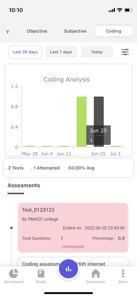
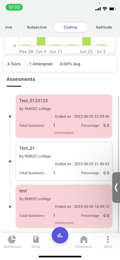
Coding Analysis:-
This section will present all the Assessments with details. In a later update, you will be able to get the Detailed Analytics report related to the assessment with a click on it.
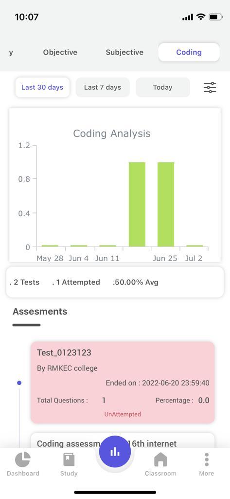
31. The bar graph shows the number of tests attempted by you in the last 30 days or last 7 days or Today, you can as well choose a particular time period and/or subject by clicking on the custom filter.
- Once you click on the Custom filter button the filter card appears with the calendar, semester and subject options.
- Select the desired date, semester and subjects and click on apply. The filter will be used for all the analyses.
- To revert the custom filter click on the Reset option.
32. The following details are given in for all the Assessments(Coding) in the specific time period,
- The Total Number of Assessments(Coding) assigned by your faculty
- Total Number of Assessments(Coding) Attempted by you.
- The Total Time Spent(in Minutes) by you in all the Attempted Assessments(Coding).
- Average Percentage scored by you in all the Assessments(Coding).
 33. In a later update, you will be able to get the Detailed Analytics report related to the assessment with a click on it.
34. The Assessments(Coding) which are not attempted by you will be given in Red color.
Aptitude:-
Know your analytical strengths with a detailed category-wise performance report.
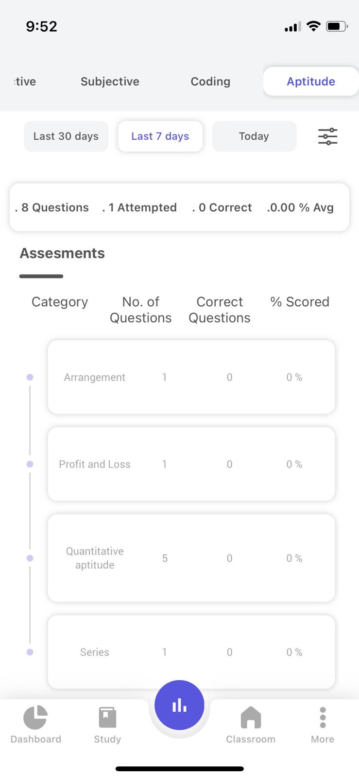
a. Summary:-
35. The following details are presented in your Summary section for the selected Time Range(for example:- Last 30 days)
- Total Questions that were sent through Question of the Day in the selected Time Range(for example:- Last 30 days)
- Total Questions Answered by you.
- Total Questions Rightly Answered by You.
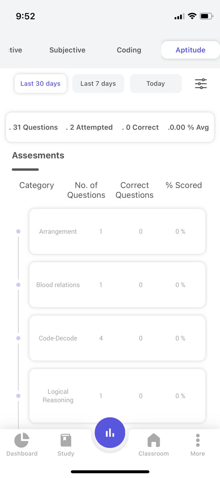 b. Category-wise performance:-
36. For all the Topics or Categories in Aptitude, you will be presented with information about
- Topic/Category Name
- Total Questions Sent through Question of the Day from that Topic/Category
- Total Questions Answered by you in that Topic/Category
- Percentage scored.


